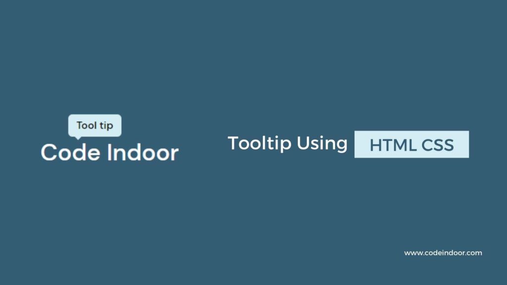
In this blog, you will learn how to create a tooltip using HTML and CSS. In this post, we are going to use pseudo-elements to create a tooltip.

As you saw in the above video, we are going to display the tooltip when we hover over the text.
HTML Code
<!DOCTYPE html>
<html lang="en">
  <head>
    <meta charset="UTF-8" />
    <meta http-equiv="X-UA-Compatible" content="IE=edge" />
    <meta name="viewport" content="width=device-width, initial-scale=1.0" />
    <title>Tooltip</title>
    <link rel="stylesheet" href="./style.css" />
  </head>
  <body>
    <div class="container">
      <h3 class="tooltip" data-tooltip="Tool tip">Code Indoor</h3>
    </div>
  </body>
</html>
In the above HTML code, we are using the h3 tag for text, we are assigning it with the class name tooltip and we are assigning the tooltip data to the data attribute named data-tooltip.
CSS Code
@import url("https://fonts.googleapis.com/css2?family=DM+Sans:wght@400;500;700&display=swap");

html,
body {
  font-family: "DM Sans", sans-serif;
}

* {
  padding: 0;
  margin: 0;
  box-sizing: border-box;
}

.container {
  width: 100vw;
  height: 100vh;
  display: flex;
  align-items: center;
  justify-content: center;
  background-color: #345c72;
}

.tooltip {
  font-size: 1.8rem;
  font-weight: 500;
  color: #fff;
  position: relative;
}

.tooltip::before {
  content: attr(data-tooltip);
  font-size: 13px;
  position: absolute;
  left: 20%;
  bottom: 100%;
  background: #d4edf4;
  padding: 5px 10px;
  opacity: 0;
  color: #000;
  z-index: 5;
  border-radius: 5px;
  transition: 100ms opacity;
}

.tooltip::after {
  content: "";
  position: absolute;
  left: 25%;
  bottom: 92%;
  width: 8px;
  height: 8px;
  background: #d4edf4;
  opacity: 0;
  transform: rotate(45deg);
  transition: 100ms opacity;
}

.tooltip:hover::before,
.tooltip:hover::after {
  opacity: 1;
}
In the above CSS code, we are creating the tooltip using the before pseudo-element. We are getting the tooltip data inside the content of the before pseudo-element, and we are positioning it above the text, we can position the as per our wish, and the after pseudo-element is used for designing the arrow of the tooltip.
Initially for making the tooltip hidden we are using opacity as 0 to pseudo-elements. Once we hover over the text we are updating the opacity to 1 so that the tooltip is visible.
Like this, we have created a tooltip with HTML and CSS
